From the world of the built and the unbuilt...
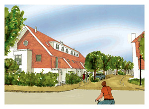
This is the look of the "inspiring suburban homes for the 21st century"?

Sad...and this isn't just about desiring a more 'modern' look. Are pitched roofs really the most efficient use of materials? (This is supposed to be an environmentally responsible development as well.) Do we really think that 'contextually-sensitive' needs to involve pastiche? are we still stuck in 1981 Milton Keynes? [sigh]. Not that I think that the alternative should be this...

It's sad that these seem to be the options that the public sees right now - plasticky modernism or watercoloured neo-vernacular. The means of rendering - bad photoshop vs bad 'artists impressions' - seems to be half the problem. There's no real impression of actual inhabitation, texture, light. You don't really think that your house will look like that, but your choice is between buying into the signals of watercolour (tradition) or photoshop (modern) - buying a lifestyle, not a design that will actually work for you in practice, in ten years time, that makes you feel good day after day.
Meanwhile, these guys want to actually build Tatlin's tower. Help them.

Sad...and this isn't just about desiring a more 'modern' look. Are pitched roofs really the most efficient use of materials? (This is supposed to be an environmentally responsible development as well.) Do we really think that 'contextually-sensitive' needs to involve pastiche? are we still stuck in 1981 Milton Keynes? [sigh]. Not that I think that the alternative should be this...

It's sad that these seem to be the options that the public sees right now - plasticky modernism or watercoloured neo-vernacular. The means of rendering - bad photoshop vs bad 'artists impressions' - seems to be half the problem. There's no real impression of actual inhabitation, texture, light. You don't really think that your house will look like that, but your choice is between buying into the signals of watercolour (tradition) or photoshop (modern) - buying a lifestyle, not a design that will actually work for you in practice, in ten years time, that makes you feel good day after day.
Meanwhile, these guys want to actually build Tatlin's tower. Help them.
Comments
just curious.....and reading avidly as usual of course....